

Warning Heat Transfer Labels: Essential Safety Signage for Your Company
2026-09-11
Walk through any facility and you'll see them: faded, peeling warning stickers that no one reads anymore. But safety signage isn't a one-time box to check. When heat, chemicals, and daily wear start eating away at labels, your team's safety goes with them. That's why Victorygen heat transfer label solutions are built differently. Keep reading to see how the right warning labels can hold up under real conditions and actually get noticed.
Heat Transfer Labels That Stand Firm When Temperatures Climb
Heat transfer labels that hold up under serious temperature swings don't happen by accident. The adhesive layer has to form a bond that resists softening when ovens, engine bays, or industrial dryers push past 200°C, while the face stock stays legible and doesn't curl at the edges. Getting that balance right means pairing a high-temperature acrylic adhesive with a film that can take the heat without yellowing or becoming brittle over repeated cycles.
The real test isn't a single spike on a data sheet. It's what happens after a label has been through hundreds of hot-cold cycles, exposure to oils or cleaning solvents, and direct contact with metal surfaces that radiate heat. Labels that stand firm are designed so the print doesn't fade or smear, and the adhesive doesn't leave residue behind if a tag eventually needs to be replaced. That durability shows up on components that get baked, cured, or run near exhaust systems where a lesser label would lift within days.
In practical terms, this means choosing a construction that's matched to the exact substrate - brushed steel behaves differently from powder-coated aluminum or high-temperature plastics. A label that sticks reliably to one may slide right off another once temperatures climb. Working with a supplier who tests against your actual part material and operating range is the surest way to avoid the frustration of labels that look fine at room temperature but fail the moment the heat is on.
The Real Reason Cheap Warning Labels Fade (And What to Do Instead)
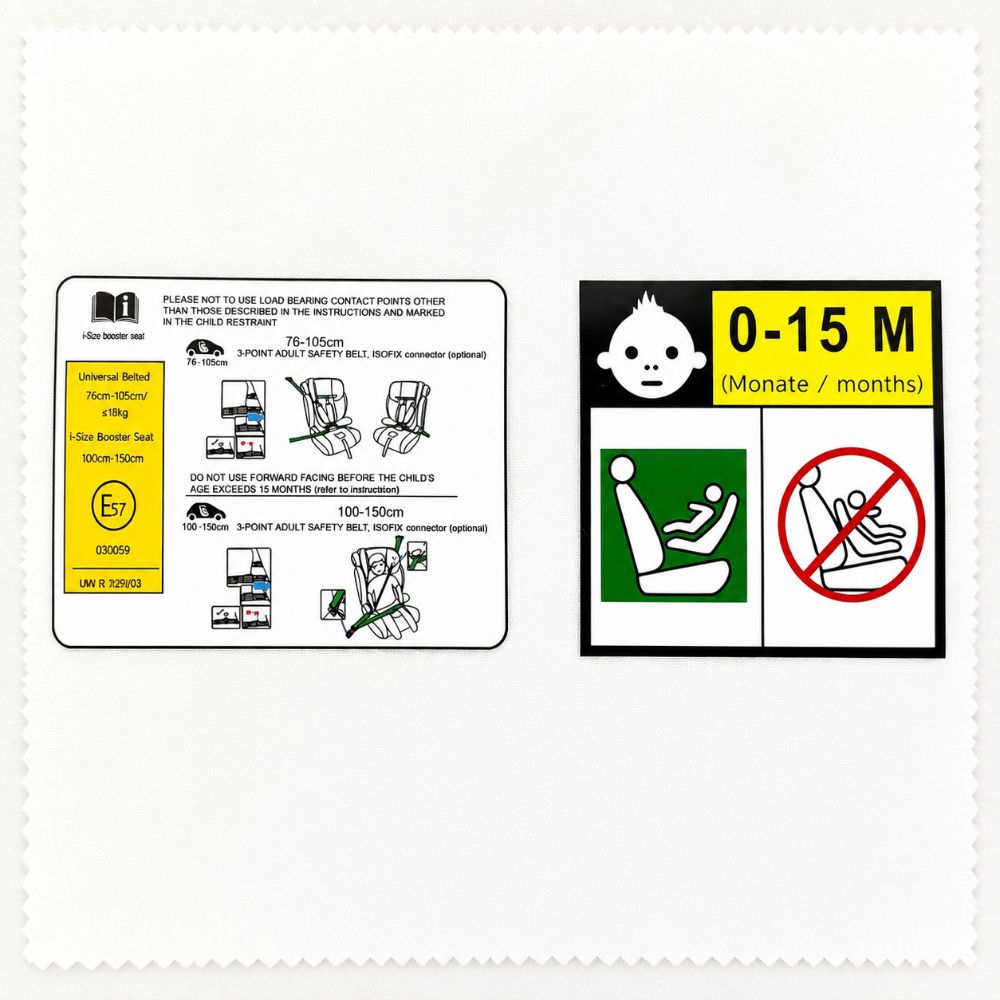
Most people assume warning labels fade because the ink is cheap or the surface gets too much sun. That's part of it, but the bigger culprit is using the wrong adhesive for the environment. A label designed for a dry, indoor warehouse gets slapped onto a wet, outdoor chemical drum, and within weeks the edges peel, moisture creeps in, and the print turns to a smeared mess. The label itself wasn't awful—it was just matched to the wrong job.
Another overlooked factor is laminate mismatch. A matte laminate might look sharp on a retail shelf, but on a pump housing or a gas canister it grabs every bit of grime and oil, accelerating wear. Cheap laminates also yellow under UV, making black text look muddy and red warnings look orange. If the laminate can't flex with the substrate, hairline cracks form and let in contaminants.
Instead of buying the cheapest label and replacing it twice a year, specify the full stack: face stock, adhesive, and laminate rated for the actual temperature range, chemical exposure, and abrasion level. Ask for a sample and leave it stuck to the real surface for a month. A label that costs 30% more up front often saves two replacement cycles and a safety citation down the line.
Matching Your Label to the Heat—Not the Other Way Around
Plenty of bottles get tagged 'medium' because that’s what the label designer preferred, while the sauce inside would make a ghost pepper flinch. The trouble starts when heat is treated as a fixed adjective rather than a range that shifts with time. Taste the batch at three points—fresh, after a day, after a week—before any wording gets locked in. Capsaicin doesn’t stay polite, and a gentle opening can build into a slow furnace.
A more grounded move is to work backward from the actual Scoville band your recipe lands in, then pick phrasing that gives an honest midpoint. If a sauce swings between 2,000 and 8,000 SHU, 'mild' sets people up for a shock and 'hot' undersells it. Think of the label as a promise about the tasting experience: bright upfront burn, creeping back-of-throat heat, and lingering numbness all deserve different wording. Describe what happens in the mouth, not what you hope the customer believes.
That also means re-testing whenever pepper suppliers change or the ratio of seeds to flesh shifts. A single harvest can move enough to push 'medium' into 'extra hot,' and no careful font choice will fix that mismatch. Write the label after the final blend is approved, not before, and keep a one-line tasting note next to the heat claim. It keeps the words honest and lets heat-seekers find exactly what they came for.
Safety Signage for Boilers, Exhausts, and Other Unforgiving Surfaces
A brushed metal plate bolted near a steam boiler does more than list temperatures—it interrupts routine. Workers who pass the same manifold a dozen times a day stop noticing the equipment itself, but a sign with a dark yellow triangle and a pictogram of a hand withdrawing from wavy heat lines resets that familiarity. The wording matters less than the visual jolt: a silhouette of a palm with two fingers missing reads faster than any sentence. In older plants, you still see hand-painted warnings where the red has oxidized to a dull rust, and those often get more respect than the glossy laminated versions because they look like they were earned.
Exhaust stacks and uninsulated steam lines are worse than boilers in one way: they don't look dangerous until you're already too close. A bare pipe at 180°C gives no shimmer, no glow, no audible cue. Signage here has to compensate for the surface's own silence. Effective installations use wrap-around bands of high-contrast tape at eye level and at the natural reach of a forearm, paired with small rectangular tags that specify the actual surface temperature range rather than a generic "HOT." Some facilities have started using thermochromic patches that shift color when the line is live, which turns the sign from a static warning into a condition indicator—a subtle but powerful shift that maintenance crews actually rely on during lockout checks.
The placement logic for these signs is rarely taught and often botched. A warning bolted directly to a boiler's front plate becomes invisible the moment someone opens an inspection door or hangs a rag over a valve. The best locations are offset from the hazard itself: on the adjacent guardrail, on the floor in painted stencil form, or on a freestanding post three steps before the danger zone. For surfaces too hot to touch but not hot enough to cause instant injury, the sign should communicate consequence rather than prohibition—"Takes skin at 3 seconds" works better than "Do not touch" because it respects the reader's intelligence and gives them a reason to comply. Over-warning is its own failure mode; when every pipe in a corridor carries an identical red tag, the truly unforgiving surfaces disappear into the noise.
How to Spot a Heat Transfer Label That's Built to Last
Start by running a fingernail along the label's edge. A durable heat transfer label won't catch or lift—the edges stay flush against the fabric. If you see any curling, cloudiness, or a waxy film forming after a few wears, it's already breaking down.
Stretch the fabric gently where the label sits. A well-made transfer moves with the material instead of cracking. After you let go, it should snap back without white crease lines or fine fractures in the print. That flexibility usually comes from a thinner, higher-quality polyurethane layer rather than a stiff vinyl.
Wash it a handful of times before trusting the label. The real test is whether the colors stay dense and the surface stays smooth after several cycles. If the print fades unevenly or the label turns tacky, it wasn't built to last. Durable transfers keep their original saturation and hand feel long after the garment has softened.
The Art of Warning Labels That Workers Can't Afford to Ignore
Most warning labels fail because they compete with everything else in a worker's field of view. A sticker that simply says “Caution” in black text on a yellow background disappears into the visual noise of pipes, gauges, and moving equipment. The ones that actually stick in the mind are the ones that tell a story. A label that reads “This valve has burned three hands this year” does more than instruct—it creates a tiny, urgent narrative that the brain can't easily discard.
Effective industrial warnings borrow from theater. They use unexpected colors, irregular shapes, or a single handwritten word scrawled next to a printed warning. A bright orange triangle placed at knee height, where a technician's eyes naturally land during a repair, beats a perfectly formatted sign mounted eight feet up. The goal isn't to be louder than every other hazard; it's to be the one thing that interrupts the autopilot of routine work. You want a moment of hesitation, because hesitation is what prevents the hand from moving toward the blade.
Some of the best warning labels aren't labels at all. A scratched-off patch of paint revealing rust underneath, a zip tie left dangling from a locked-out breaker, a small mirror angled to show a hidden pinch point—these silent cues operate below conscious thought. Workers internalize them faster than any written phrase. The real art is knowing when to print a warning and when to let the environment whisper it instead.
FAQ
They're durable adhesive tags applied with heat that carry safety warnings, like high-temperature surface alerts or burn risk notices, directly onto equipment or product surfaces.
Regular stickers can peel, fade, or melt near heat sources. Heat transfer labels bond at a molecular level to the surface, so they stay legible and intact even around ovens, engines, or hot pipes.
Anywhere people might come into contact with hot machinery or components—think industrial ovens, boilers, engine blocks, steam lines, commercial kitchen equipment, and even certain automotive parts.
Yes, most are built to resist abrasion, chemicals, UV exposure, and moisture. It's still wise to check the manufacturer's specs for the exact temperature range and chemical compatibility.
Surface prep matters. Clean away grease, rust, and debris, then use a heat press or specialized iron at the recommended temperature and pressure. Let the label cool before handling.
In the U.S., many follow ANSI Z535 or OSHA guidelines for signal words, colors, and symbols. Requirements vary by industry and jurisdiction, so it's smart to check local regulations.
Look for proof of durability testing, clear temperature ratings, custom design options, and references from similar industries. Good suppliers often provide samples for trial on your actual surfaces.
They generally conform well if the material and adhesive are chosen correctly, but extreme textures may require an alternative labeling method. It's best to test on a sample part first.
Conclusion
Many facilities discover too late that standard adhesive labels are no match for surfaces that regularly heat up. Polyester facestocks soften, adhesives break down, and printed warnings fade into unreadable smudges within a few thermal cycles. The underlying issue isn't just cosmetic—it's a failure of material selection. Heat transfer labels built for these conditions rely on high-temperature films, ceramic or polyimide bases, and cross-linked adhesives that stay bonded when metal expands and contracts. Before ordering, match the label's continuous operating temperature to the actual surface temperature of boilers, exhaust manifolds, steam traps, or hot process piping. Don't force a general-purpose label onto a 400°F pipe and expect it to survive. Check the product's rated heat range, chemical resistance, and whether the manufacturer has tested it under thermal shock. This kind of matching prevents the premature fading and peeling that undermines safety signage.
Durability alone isn't enough if the warning doesn't grab attention. A label that survives but becomes faint or discolored is no safer than one that falls off. Long-lasting heat transfer labels keep their color density and contrast even after repeated heat cycling, so the pictogram and text remain readable from a normal working distance. Effective warning design uses bold color zones—red, yellow, and black—with clear symbols for burn hazards, hot surfaces, and required PPE. Placement matters just as much: mount the label where a worker's line of sight naturally lands before touching or reaching near the hazard. For high-vibration or tight-clearance areas, low-profile transfer labels hold up better than riveted metal tags that can snag or corrode. When workers can instantly recognize a hazard from three feet away, compliance stops being an afterthought and becomes part of the daily routine.
Contact Us
Contact Person: Wang Song Lin
Email: [email protected]
Tel/WhatsApp: +8613751282193
Website: https://www.heat-transferprinting.com/