

Custom PP Cream Jar Designs to Elevate Your Beauty Brand
2026-09-01
Your cream jar isn't just packaging—it's a silent brand ambassador that speaks volumes before the lid even twists open. Generic containers, however, say nothing at all. Custom PP cream jar designs fill that gap, letting you control texture, color, and shape to match your brand story. At Zhejiang Haitong Plastic Industry Technology Co., Ltd., we've spent years perfecting injection-molded jars that feel as good as they look, helping beauty brands turn everyday skincare into a premium ritual. Here's how to make your packaging the standout on any vanity.
Why PP Makes Sense for Modern Cream Jars
PP's real advantage in cream jars isn't just that it's cheap—it handles the stuff inside better than most materials. Creams and lotions often carry oils, emulsifiers, and mild acids that can stress cheaper plastics or corrode metal lids over time. Polypropylene shrugs those off, so the jar keeps its seal and appearance after months on a shelf or in a humid bathroom.
The material also lets designers go slim without making the jar feel flimsy. Thin-walled PP jars have enough flex to survive drops that would crack acrylic or glass, yet the surface takes matte or soft-touch finishes well. That gives brands a premium look while keeping the total package light enough to cut freight cost—not something you get with heavyweight alternatives.
On the production side, PP molds fast and releases cleanly, which shortens cycle times and reduces rejects. It's also mono-material friendly: a PP jar with a PP cap and PP liner can be recycled as one stream, a practical detail many modern skincare lines are starting to value.
Sculpting Brand Identity Through Jar Shape
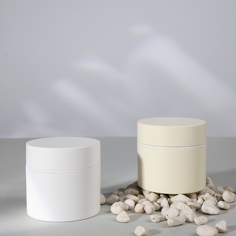
The silhouette of a jar often does more for recognition than any label ever could. A softly rounded shoulder suggests comfort and tradition, while a sharp, architectural profile reads as modern and precise. These choices aren't decorative; they shape how a hand approaches the container, how light moves across the glass, and how the product feels before the lid is even removed.
Consider the difference between a squat, wide-mouth vessel and a tall, slender one filled with the same formula. The former invites scooping and signals generosity, the latter implies restraint and ritual. Subtle proportion shifts—a tapered neck, a beveled base, a slightly convex wall—become proprietary design cues that customers remember without knowing why.
Brand identity through jar shape also works in negative space. The gap between cap and shoulder, the radius of a corner, the way a label sits flush or recessed all communicate intent. When every other brand in the category defaults to a standard cylinder, owning an unusual but functional geometry gives the shelf a quiet point of view.
Matte, Gloss, or Soft Touch Finishes That Signal Quality
A surface you actually want to touch changes the way you perceive an object before you even use it. Matte finishes hide fingerprints and feel quietly confident, while gloss draws the eye with depth and reflective clarity. Soft touch coatings go a step further, adding a velvety grip that reads as intentional luxury rather than an afterthought.
The distinction between a $20 gadget and a $200 one often comes down to this tactile layer. Matte diffuses light evenly, masking minor imperfections and lending a modern, understated tone. Gloss, on the other hand, amplifies color saturation and creates a jewel-like presence, though it demands more care to keep pristine. Soft touch blurs the line between material and skin, making daily interactions feel more deliberate.
Manufacturers don't choose these finishes randomly. A matte surface suggests practicality and focus, gloss signals bold design confidence, and soft touch whispers ergonomic thoughtfulness. When a product gets this right, you notice it the moment your fingers land on it—and that memory of quality outlasts any spec sheet.
Debossing and Embossing Details That Elevate Perception
The first thing people notice isn’t always the logo itself, but how it feels under their fingertips. A shallow deboss can read as quiet and refined, while a deeper impression adds weight and intention. The crispness of the edges matters just as much — a softly rounded rim feels approachable, whereas a sharp, clean break suggests precision engineering.
Embossing works with light in a way that flat print never can. Raised surfaces catch shadows differently depending on the angle, giving even simple monograms a sculptural quality. On textured or uncoated stock, the highlights soften and the effect becomes more tactile, almost fabric-like. Skilled operators control paper stretch during the strike so the raised area stays smooth without cracking or distorting the surrounding fibers.
When paired with a subtle blind pattern or a very fine registered foil, these techniques stop being decoration and start acting as silent signifiers. The difference between an ordinary box and one that feels worth keeping often comes down to a few microns of depth. People may not consciously analyze it, but their hands remember the moment they touched something made with care.
Designing Jars That Feel Good in Your Hand
The weight shifts as you tilt the jar, and that's when the subtle ridge near the base catches your thumb—not too sharp, just enough to anchor your grip while the rest of your fingers find their place along a gentle curve. It's the kind of detail you don't notice until you've been holding it for a minute, and then you realize you haven't thought about dropping it once. That's the real work: making a shape that disappears into your hand while still giving you something to hold onto.
Most people never read the label on the bottom, but they'll remember if a lid fought back or if the glass felt slippery with condensation. So we spend more time on the shoulder of the jar—where the neck begins to widen—than on any other surface. A steeper slope there means your palm rests lower, which changes how the whole container balances when it's half empty. It sounds small, but it's why some jars feel like they belong in a cupboard and others feel like they belong in your hand.
Then there's the finish. Not the glossy shine, but the way the surface meets your skin. A slight matte texture on the lower third can keep a jar from sliding forward when you're scooping out the last of the peanut butter, while a polished band near the top gives your fingertips a signal that they're near the opening. Combine that with a lid that's wider than the neck but not wider than your palm, and you've got something that quietly earns a spot on the counter instead of the back of the shelf.
Eco-Conscious PP Choices That Keep Beauty Luxe
Luxury beauty often feels inseparable from heavy glass and layered plastics, but a quiet shift is taking place behind the scenes. Polypropylene, or PP, has stepped into the spotlight as a material that doesn't ask you to trade elegance for responsibility. Think airless pumps that glide with satisfying precision, frosted jars that catch the light just so, and slim compacts that feel substantial in your palm—all crafted from a resin that is endlessly recyclable without losing its integrity. The charm lies in the details: soft-touch matte finishes, gently weighted caps, and translucent walls that let a serum's hue glow through, proving that sustainable packaging can still whisper indulgence.
What makes PP particularly captivating for high-end skincare and makeup is its marriage of durability and lightness. Unlike glass, it won't shatter in a travel bag; unlike many conventional plastics, it resists cracking under the pressure of daily use. Brands are now embracing mono-material designs—pumps, bottles, and closures all in PP—so that the entire piece can be recycled in one stream, no disassembly required. Add in elegant secondary touches like bamboo over-caps or recycled aluminum collars, and you get packaging that feels collectible rather than disposable. It's a small rebellion against throwaway culture, wrapped in a finish that still earns a spot on your vanity.
The real luxury, perhaps, is knowing that the object in your hand was designed with its next life in mind. Refillable PP pods slip into keepsake outer shells, allowing the ritual of replenishing a favorite moisturizer to feel as deliberate as choosing the formula itself. Some brands even offer take-back programs that grind old PP components into new ones, closing the loop without compromising on the sculptural beauty of the original piece. This is where eco-consciousness stops being a compromise and becomes a quiet upgrade: packaging that respects the planet while still making you feel like you're holding a small work of art.
FAQ
PP gives you a lightweight jar that won't shatter if it slips off a bathroom shelf, and it plays nicely with most cream formulas. It also handles temperature swings well, so your product stays stable from a hot car to a cold bathroom. The material is recyclable in many areas, which is a quiet plus for customers who read the bottom of the jar.
You can do both. If you want something truly yours, a custom mold lets you tweak the shoulders, base, and even the inner jar profile to match a specific texture or brand vibe. For smaller runs, picking an existing mold and changing the color, cap, and label still gives you a distinct look without the tooling cost.
Silk screening and hot stamping are workhorses for clean logos and metallic details. For a soft-touch or matte finish, a spray coating can make the jar feel more expensive in the hand. In-mold labeling is another route if you want the artwork fused right into the surface so it won't scratch off over time.
A lot. If you use a double-wall PP jar, air and light don't hit the product as easily, which helps delicate actives stay potent. A wide mouth lets customers scoop out the last bit with a spatula, and a slight inner dome can reduce product sticking to the lid. These choices make the jar feel designed for real use, not just photos.
For a fully custom mold, many factories will ask for 10,000 to 50,000 pieces because the mold itself is a serious investment. If you're testing the market, a stock jar with your own color, cap, and label can often start around 1,000 to 5,000 units. It's worth asking the supplier about hybrid options where you pay a small fee for a custom cap but use an existing base.
Instead of defaulting to white or clear, look at colors that echo your formula or story. A pale sage for a botanical line, a warm taupe for a minimal brand, or a deep chocolate brown for a rich butter. Consider the cap and label as a pair: a matte jar with a glossy cap in the same color can add subtle depth. Always request physical color chips because digital mockups lie about opacity and tone.
Yes, but be specific. PP is widely recyclable, and some suppliers offer post-consumer recycled PP or refillable inner cups that drop into a reusable outer jar. You can also design the jar to be mono-material—same plastic for jar and cap—so it's easier to recycle. Avoid vague 'green' language; tell customers exactly how to recycle or refill it.
Conclusion
Polypropylene earns its place in luxury packaging not by mimicking glass, but by doing what glass can't. Its lightweight resilience lets you explore profiles that would be fragile or costly elsewhere—thick walls, soft squared shoulders, gently tapered bases—so the jar itself becomes a quiet signature. A well-chosen shape does more than hold cream; it shapes how your brand is remembered on a vanity. Pair that silhouette with a finish that matches your promise: a deep matte for understated clinical trust, a high-gloss pour for playful energy, or a velvety soft-touch coat that begs to be picked up. These surface choices aren't decorative afterthoughts; they're the first tactile conversation a customer has with your product.
Details like debossing and embossing turn a standard jar into an object with intent. A recessed logo catches light differently than a raised one, offering either subtle depth or confident assertion. And because PP allows precise molding, you can place these marks exactly where fingers naturally rest—on the lid's edge or the jar's shoulder—so the brand is felt before it is read. Designing for the hand matters as much as designing for the eye: a slight inward curve, a balanced weight, a lid that opens with a satisfying, controlled turn. Even eco-conscious choices fit this elevated story; recycled or bio-attributed PP retains the clean, sturdy feel your customers expect while quietly reducing footprint. Custom PP cream jars, then, are not just containers but intentional extensions of your brand's physical presence.
Contact Us
Contact Person: Kara Yang
Email: [email protected]
Tel/WhatsApp: 8618857568397
Website: https://www.haitongplastic.com/